PILLAR 3 — SLIDE STRUCTURE & FRAMEWORKS (2025 EDITION)
1 — Why Slide Structure Matters More Than Visual Design in 2025
In 2025, VCs are exposed to more pitch decks than ever — thousands per year, with many filtered by AI before a human even scans them. Ironically, this increase in volume has made one thing more important than anything else:
👉 Slide structure — not slide design — is what gets founders funded.
Founders often obsess over polish:
colors, typography, gradients, icons, glossy UI mockups, aesthetic minimalism, or hyper-modern layouts.
But investors aren’t judging your deck like a Dribbble shot. They’re assessing cognitive clarity, narrative flow, and investment logic — all of which depend on structure.
A beautifully designed deck with poor structure feels like chaos.
A well-structured deck with simple design feels like authority.
This is one of the biggest misunderstandings first-time founders have.
Investors Don’t Read; They Pattern-Match Narrative Logic
Every experienced investor will tell you:
“A pitch deck isn’t read — it’s scanned.”
VCs are scanning for four things:
Does this story make sense in the correct order?
Can I explain this startup in one sentence internally?
Does each slide build on the previous idea logically?
Does the structure reduce or increase perceived risk?
Meaning → your deck is not a slideshow.
It’s a persuasion sequence.
A founder’s mastery of structure tells investors:
✔ how they think
✔ how they prioritize
✔ how they build
✔ how they will sell
✔ how they will raise the next round
✔ how they’ll communicate with future teams
This is why founders who use proven structures — like the sequences explained in the VC PITCH DECK → https://fundingblueprint.io/ — consistently outperform those who rely only on “beautiful slides.”
Because structure is cognition.
Structure is logic.
Structure is leadership.
The Role of Cognitive Load in Modern Pitching
Every slide has a “processing cost.”
If the investor’s brain must work too hard to understand what’s being said, the pitch loses momentum.
Strong structure reduces cognitive load by:
✔ creating predictable patterns
✔ placing insights where the brain expects them
✔ aligning content with decision-making psychology
✔ connecting pain → solution → market → logic
✔ moving from simple → complex instead of chaos
Weak structure increases cognitive load and creates:
✘ confusion
✘ narrative gaps
✘ repetition
✘ investor fatigue
✘ lower perceived founder intelligence
Investors have told founders for years:
“Make it easy to understand your business.”
But what they really mean is:
“Make your story easy to think through.”
This is the job of slide structure — not design.
Why Structure Matters More Than Ever in 2025
Decks are no longer evaluated only by humans.
Modern VC workflows rely on:
AI-driven deck screening
structured scoring frameworks
pattern-recognition heuristics
partner-level internal summaries
fund thesis alignment engines
category readiness signals
These systems don’t care about beauty.
They care about clarity, sequence, and logic.
A well-structured deck survives modern filtering.
A design-heavy, structure-light deck dies instantly.
Why This Pillar Starts With Structure (Not Slides)
Most pitch-deck articles begin with “Slide 1, Slide 2, Slide 3…”
This is backward and leads to decks that feel linear but not logical.
Slide structure should be built like:
→ a story
→ a psychological journey
→ a narrative arc
→ a strategic reveal
→ an investment thesis
We begin this pillar with structure because once the structure is correct:
✔ every slide becomes easier to write
✔ transitions become natural
✔ the deck feels investor-native
✔ your pitch becomes partner-ready
✔ you reduce rewriting time by 50–80%
Structure is the foundation of persuasion.
2 — The Psychology Behind the Perfect Pitch Deck Flow
(Why Investors Expect Slides in a Specific Cognitive Order)
Most founders think slide sequence is “a matter of preference.”
But inside VC funds — from seed investors to $1B+ growth funds — slide order follows a psychological pattern that mirrors how humans process belief formation.
You’re not just presenting slides.
You’re guiding an investor’s brain through:
understanding
belief
resonance
expansion
risk evaluation
optimism
justification
A pitch deck is a journey, not a file.
And that journey only works when the slides appear in a sequence that reflects the way investors think.
This is why Sequoia, YC, Index, a16z, and First Round have almost identical pitch structures — not because they copy each other, but because human cognition has patterns, and those patterns work.
In 2025, these patterns matter more than ever.
Why Investors Need the Right Information at the Right Time
Investors don’t evaluate every slide with equal weight.
In fact, their minds go through a very predictable cycle:
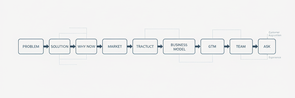
Step 1: Is this problem real and painful?
(Problem slide)
Step 2: Does this solution logically fix it?
(Solution slide)
Step 3: Why is this urgent right now?
(Why Now slide)
Step 4: How big is the opportunity if this works?
(Market/TAM slide)
Step 5: Does the product actually do what they claim?
(Product slide)
Step 6: Are customers showing signs of adoption?
(Traction slide)
Step 7: Will this turn into a scalable business?
(Business model)
Step 8: Can this team win?
(Team slide)
Step 9: What do they need from us?
(Ask slide)
Each step builds on the previous one —
and skipping a step breaks the logic chain.
This is why decks with the wrong slide order feel:
✘ scattered
✘ unprofessional
✘ amateurish
✘ confusing
✘ “not investable yet”
Investors expect slides to appear in a sequence that mirrors the mental model they use to evaluate companies.
The moment your deck deviates from that cognitive model, investors subconsciously downgrade your pitch.
The Rule of Cognitive Bridges (The Real Secret Behind Flow)
Between every major slide, there must be a narrative bridge — the investor’s brain must naturally flow from one idea to the next.
Examples of cognitive bridges:
Problem → Solution
= “This pain exists, therefore THIS is the fix.”
Solution → Why Now
= “This fix wasn’t possible until NOW because of X, Y, Z shifts.”
Why Now → Market
= “Since the timing is right, the market unlocks.”
Market → Product
= “This opportunity demands a product like this.”
Product → Traction
= “Here’s proof that the product matches market demand.”
These bridges reduce cognitive load.
They make the narrative frictionless.
They make investors feel like the idea is inevitable.
Because it works.
Why This Matters More in 2025 (AI + Analyst Screening)
Today, 20–40% of decks are rejected by:
automated filters
analyst scoring models
internal notation tags
narrative heuristics
pattern-recognition tools
These systems do NOT understand complex design.
They understand:
✔ structure
✔ headings
✔ sequence
✔ clarity
✔ causality
Which means:
A founder who masters structure bypasses AI screening, catches analyst attention, and gives partners a story they can repeat internally.
This is strategic communication — not slide decoration.

3 — The Slide Hierarchy Rule
(Why Some Slides Matter 10× More Than Others in a VC Pitch Deck)**
Every pitch deck has 10–12 slides.
But what most founders never learn is this:
👉 Some slides carry 10× more weight in investor decisions.
👉 Some slides matter almost zero.
And the difference between the two determines whether your pitch feels:
✔ tight
✔ credible
✔ logical
✔ fundable
—or—
✘ random
✘ unfocused
✘ amateur
✘ “not ready”
In 2025, VCs use structured evaluation models.
These models — whether informal or explicit — follow a hierarchy:
Some slides create belief,
some reinforce belief,
and some validate belief.
When you know which slides sit where in this hierarchy, your deck stops being a list of slides and becomes a truly strategic persuasion tool.
Let’s break down the actual slide hierarchy investors use — the same one top founders internalize.
Tier 1 — Slides That Decide the Meeting (The “Core 3”)
VCs often say:
“We make a decision in 30 seconds.”
This is because three slides determine 80% of investor conviction:
1. Problem
Is this a real, urgent, expensive, accelerating pain?
2. Solution
Is this the inevitable fix, not merely a feature?
3. Why Now
Why is RIGHT NOW the perfect time for this company to exist?
These slides are your investment thesis.
Everything else supports them.
If these three are weak → your deck dies.
If they’re strong → every other slide becomes easier to believe.
This is why your earlier pillars (Pillar 1 & 2) matter so much.
Tier 2 — Slides That Make Your Startup Feel “Big Enough”
These slides don’t create conviction…
they expand it.
4. Market Size (TAM/SAM/SOM)
Signals potential scale.
5. Product (Feature Summary or Micro-Flow)
Shows feasibility + clarity.
6. Traction
Proves demand and reduces risk.
If Tier 1 answers:
“Why does this exist?”
Tier 2 answers:
“How big can this get?”
Tier 3 — Slides That Remove Investor Anxiety (Risk Reducers)
These slides clean up the logical leftovers:
7. Business Model
Can this become profitable?
8. GTM (Go to Market)
How will you acquire customers efficiently?
9. Competition
Why you win when others fail?
10. Team
Why YOU (not someone else) can execute this idea?
These slides don’t create excitement.
They create comfort.
Comfort is what helps a partner say:
“I can defend this investment internally.”
Tier 4 — Slides That Only Matter in Context (Optional/Appendix)
These are rarely necessary on the main deck:
Milestones
Roadmap
Product screenshots
Extended financials
Legal notes
Tech architecture
Operational backend
Revenue cohorts
Market microtrends
They are supporting documents — not persuasion slides.
Mistake founders make:
❌ putting low-importance slides early
❌ burying high-importance slides
❌ adding slides investors don’t need
❌ making the deck longer than 12–14 main slides
The hierarchy is not personal preference; it’s investor cognition.
The Risk of Breaking Slide Hierarchy
Investors subconsciously penalize decks that break hierarchy:
Problem comes too late → narrative breaks
Why Now is missing → timing unclear
Traction too early → feels defensive
Competition too soon → feels insecure
Team too early → feels ego-driven
GTM too early → feels premature
Hierarchy = trust.
Breaking hierarchy = confusion.
The goal is not rigid order;
it’s psychological sequence.


4 — The 3 Narrative Anchors That Hold a Pitch Deck Together
(Without These, Even Beautiful Slides Collapse)
Most founders assume that a pitch deck is simply “slides in order.”
But investors don’t evaluate slides individually.
They evaluate how well the slides reinforce each other.
This reinforcement comes from something called narrative anchoring — a persuasion concept used by top storytellers, brand strategists, and venture partners.
Narrative anchors are the three core ideas that your entire deck orbits around.
If they are strong, the deck feels inevitable.
If they are weak, the deck feels scattered.
In 2025, narrative anchoring has become even more critical because:
investors are scanning faster
AI is pre-filtering decks
funds use structured scoring
partners need internal selling tools
A deck without anchors looks like:
✘ disorganized
✘ inconsistent
✘ amateur
✘ “generic founder energy”
A deck with anchors feels:
✔ intelligent
✔ intentional
✔ strategic
✔ partner-ready
Let’s break down the three anchors that every VC expects — even if they never explicitly mention them.
Narrative Anchor #1 — The Central Pain Thesis
(Everything in your deck must point back to this)
Your deck must revolve around one core problem, not a list of problems.
Founders often dilute their pitch by trying to include:
6–7 pains
multiple user personas
multiple market segments
too many bottlenecks
This creates narrative noise and breaks investor cognition.
A strong Central Pain Thesis looks like:
“Scaling teams suffer from workflow fragmentation that destroys efficiency.”
or
“Mid-market logistics teams lose 20–40% productivity to exception handling.”
Everything else in your deck — your solution, market, product, GTM, traction — must reinforce this thesis.
If the pain thesis is unclear →
investors cannot follow the logic thread of your deck.
A good way to test clarity is to run the Problem → Solution transition through your AI pitch deck analyzer → https://fundingblueprint.io/ai-pitch-deck-analysis
because it shows exactly where the narrative breaks.
Narrative Anchor #2 — The Inevitable Solution Logic
(This must feel like the only logical fix to the core problem)
A strong solution does NOT feel like:
✘ a “product idea”
✘ a “feature list”
✘ an “innovation attempt”
✘ a “cool concept”
It must feel like:
👉 the ONLY thing that makes sense
Investors subconsciously ask:
“If this pain is real, is their solution the inevitable industry evolution?”
This is why the best Solution slides share:
clean logic
workflow realism
wedge clarity
compounding value
expansion path
category-creation potential
Inevitability = fundability.
If the solution feels optional, investors lose conviction immediately.
Narrative Anchor #3 — The High-Conviction “Why Now” Moment
(Your entire deck collapses without this)
Investors don’t fund ideas.
They fund timing.
A perfect “Why Now” shows that the market has shifted in a way that unlocks your business right now, not five years ago, not three years later.
Examples of strong “Why Now” anchors:
regulatory pressure increasing
AI automation creating new workflows
new buyer personas emerging
cost pressure forcing efficiency
remote work creating operational gaps
data explosion breaking old systems
demographic shifts
industry consolidation
infrastructure maturity
A weak Why Now makes your deck feel:
✘ too early
✘ too late
✘ unnecessary
✘ not compelling
A strong Why Now makes investors think:
“If we don’t fund this now, we will miss it.”
This is the psychological anchor that pushes a partner to move your deck forward in the funnel.
Why These Anchors Matter More Than Any Design or Visual Element
Narrative anchors are what:
✔ keep the deck coherent
✔ make your pitch easy to repeat internally
✔ reduce cognitive load
✔ improve partner advocacy
✔ strengthen the internal memo
✔ create a clear mental model of your startup
✔ position your solution as inevitable
When these three anchors align, your pitch deck becomes:
simple
persuasive
“partner-ready”
easy to believe
easy to champion internally
Investors don’t remember your entire deck —
they remember your anchors.


5 — The Causality Chain Principle
(How Smart Decks Build Momentum Slide After Slide — and Weak Decks Don’t)
The most sophisticated pitch decks — the ones that feel “inevitable” to investors — all share one core characteristic:
👉 Every slide causes the next slide.
This is called the Causality Chain —
a narrative technique used by world-class communicators, growth-stage founders, and top-tier VC partners.
A deck with a strong causality chain feels like:
✔ a continuous argument
✔ a logical progression
✔ a persuasive narrative
✔ a clear mental model
✔ a story that pulls you forward
A deck without a causality chain feels like:
✘ disconnected facts
✘ slides glued together
✘ no compelling flow
✘ no narrative gravity
✘ cognitive resistance
Even if every slide is individually “good,” the deck will fail if the links between them are weak.
This is why so many beautifully designed decks still feel confusing or forgettable.
The investor won’t say anything verbally —
they’ll simply lose belief in the story.
Let’s break down how causality works.
The Causality Chain (Investor Psychology)
VCs unconsciously evaluate your pitch like a sequence of “if → then” statements.
Your deck must function like this:
IF the problem is real → THEN the solution makes sense.
IF the solution makes sense → THEN timing matters.
IF timing is perfect → THEN the market opens.
IF the market opens → THEN the product fits.
IF the product fits → THEN traction proves it.
IF traction proves it → THEN the economics work.
IF economics work → THEN the team can execute.
If any link breaks…
the entire pitch collapses.
Investors may not consciously notice the break,
but they feel it.
This “felt confusion” is one of the top reasons decks get rejected during partner review.
The Most Common Causality Breaks Founders Accidentally Create
Here are four patterns that break the chain instantly:
1. Problem → Solution mismatch
The solution feels disconnected from the actual pain.
2. Solution → Why Now mismatch
The solution feels possible anytime, not specifically now.
3. Market → Product mismatch
The product doesn’t logically match the opportunity size.
4. Traction → Business Model mismatch
Founders show user growth, but not revenue logic.
VCs call these:
“narrative gaps” or “logic jumps.”
One logic jump can kill your deck.
The “Frictionless Flow” Rule (How Great Decks Feel Effortless)
When a pitch deck’s causality chain is strong, investors experience:
✔ no re-reading
✔ no questions about logic
✔ no narrative confusion
✔ no cognitive load
Everything flows.
This is exactly why the highest-performing decks often follow the modern “investor cognition sequence” explained earlier — and also why reviewing examples inside the Pillar 2 deep dive → https://fundingblueprint.io/problem-and-solution-slides strengthens your mental model of what smooth causality looks like.
Because causality isn’t about slides —
it’s about how slides connect.
How to Build a Perfect Causality Chain (Step-By-Step)
Use this 5-step method in your outline:
Step 1: Identify the core pain (the thesis)
Everything begins with a singular, unambiguous pain.
Step 2: Show the inevitable fix (solution logic)
Your solution must feel like a rational extension of the pain.
Step 3: Justify timing (macro + micro shifts)
Timing must feel like a structural unlock — not hype.
Step 4: Expand logically to opportunity (market proof)
The market should feel “open and ready.”
Step 5: Validate credibility (traction + team)
This proves your story is not theoretical — it’s real.
If each step logically causes the next,
your deck will feel like a persuasive, founder-intelligent narrative.
The Investor Test: “Could I Pitch This Internally After One Read?”
Partners internally pitch your startup to other partners.
They need to summarize you in 20–30 seconds.
If the causality chain is strong, the partner can pitch your idea confidently.
If it’s weak, the partner stumbles —
and the deal dies.
This is the real, behind-the-scenes reason many founders never reach IC.


6 — The Lock-In Effect
(How to Make Each Slide Strengthen the Next One and “Lock” Investors Into Your Narrative)
Some pitch decks feel like a smooth journey.
Others feel like a collection of slides stitched together.
The difference comes down to The Lock-In Effect —
a persuasion mechanism where each slide increases the investor’s commitment to your story.
When this effect is active, investors feel:
✔ pulled into the narrative
✔ emotionally anchored
✔ logically aligned
✔ progressively more convinced
✔ unwilling to “bounce out” of the deck
When the lock-in effect is weak, investors feel:
✘ detached
✘ unconvinced
✘ mentally “resetting” every slide
✘ unable to build cumulative belief
✘ no reason to stay engaged
The lock-in effect is the engine that transforms a sequence of slides into a persuasive, partner-ready investment narrative.
Let’s break it down.
What “Lock-In” Means in VC Psychology
Every human brain seeks consistency in its beliefs.
If you introduce information in a clear causal sequence, the brain “locks onto” the pattern and continues following it.
In VC decision-making, this means:
→ once a partner accepts your Problem—
→ they are open to accepting your Solution
→ and then they evaluate Why Now
→ and then Market logic
→ and then Product logic
→ and then Traction logic
This is not emotional manipulation.
It’s simply how cognition works.
The lock-in effect makes your pitch feel inevitable.
The 4 Elements of a Lock-In Slide Sequence
For a deck to create this effect, it must contain four psychological elements.
Let’s break them down.
1. Progressive Complexity (Simple → Complex)
You begin with the easiest possible idea to understand (the Problem).
Then you gradually increase complexity.
This makes the investor feel:
✔ “I understand this.”
✔ “I’m following this.”
✔ “I see where this is going.”
If complexity jumps too fast—
the lock-in breaks.
This is why top decks never start with product features or screenshots.
2. Narrative Tension (Each Slide Answers One Unanswered Question)
Great decks create a “pull forward” effect.
Each slide should raise the question that the next slide answers.
Examples:
Problem →
“How do we fix this?” → Solution
Solution →
“Why now?” → Why Now
Why Now →
“How big is this?” → Market
Market →
“Does the product work?” → Product
Product →
“Do customers care?” → Traction
Traction →
“Does this make money?” → Business Model
Business Model →
“Can this team execute?” → Team
This is how narrative momentum is built.
3. Reinforced Logic (Each Slide Makes the Previous One Stronger)
The investor should feel:
✔ “My belief in the problem is increasing.”
✔ “My belief in the solution is increasing.”
✔ “My belief in the timing is increasing.”
This creates cumulative credibility —
the core of the lock-in effect.
Weak decks don’t reinforce previous claims.
Strong decks build on them.
This reinforcement pattern is exactly why the entire structural blueprint inside the full pitch deck guide → https://fundingblueprint.io/vc-pitch-deck-guide is organized around inter-slide reinforcement rather than slide templates.
4. Commitment Momentum (Micro-Decisions Add Up)
Investors make dozens of micro-decisions while reading:
✔ “Okay, that makes sense.”
✔ “Yeah, that is a real problem.”
✔ “Right, this solution fits.”
✔ “Yes, the market is big.”
✔ “Okay, traction looks real.”
✔ “This is interesting.”
Each of these micro-yeses increases commitment.
By the time they finish the deck, they’ve subconsciously “agreed” with the logic chain — and it becomes psychologically harder to disagree later.
This is why decks with smooth logic flow perform 3–5× better in partner review.
The Founder's Advantage: When Lock-In Is Done Right
When the lock-in effect is strong:
✔ investors stay engaged
✔ partners feel confident pitching you internally
✔ analysts score your deck higher
✔ AI filters pass your deck more often
✔ narrative gaps disappear
✔ you avoid the “interesting but not convinced” verdict
This is how great decks win investor trust.
Not by being flashy.
Not by being artistic.
But by being irresistibly easy to believe.


7 — The Narrative Spine
(The Core Structural Blueprint That Holds the Entire Deck Together)
If the Causality Chain (Section 5) explains how slides connect…
and the Lock-In Effect (Section 6) explains how investors stay engaged…
Then the Narrative Spine is the central framework that determines whether your pitch deck:
✔ feels cohesive
✔ feels intelligent
✔ feels mature
✔ feels fundable
✔ creates internal belief
—or—
✘ feels scattered
✘ feels amateur
✘ feels linear-but-empty
✘ feels like “just slides”
✘ fails during partner-level review
The Narrative Spine is the core storyline that runs through your entire pitch — the argument that ties together:
your pain thesis
your product logic
your timing
your market readiness
your traction
your economics
your execution ability
Without a strong narrative spine, your pitch feels fragile.
With it, your pitch feels inevitable.
Let’s go deep.
What Is the Narrative Spine? (VC Definition)
The Narrative Spine is the single through-line that your entire pitch deck must support.
Investors describe it like this:
“I need to understand the one big idea this founder believes about the world.”
The Narrative Spine is that big idea —
the logic you want investors to walk away believing.
Examples from famous decks:
Airbnb’s spine:
“Millions of empty rooms exist — and travelers want affordable, local experiences.”
Uber’s spine:
“Transportation is inefficient and unreliable — software can make it instant and on-demand.”
Notion’s spine:
“People want one flexible tool — not dozens of fragmented apps.”
Stripe’s spine:
“Payment complexity is blocking the internet economy.”
Each spine is simple —
but profoundly structural.
The 3 Qualities of a Strong Narrative Spine
A powerful Narrative Spine has three characteristics:
1. It Must Be Rooted in Inevitable Truth
Investors must feel:
✔ “This is obviously happening.”
✔ “This problem cannot be ignored.”
✔ “This shift is irreversible.”
Weak spines feel like:
✘ predictions
✘ guesses
✘ founder opinions
✘ hypothetical futures
A strong Narrative Spine feels like present tense inevitability.
2. It Must Be Extremely Simple (But Not Shallow)
If a partner can’t repeat your spine in 10 seconds to another partner:
→ your pitch will NOT reach Investment Committee.
This is why pitch frameworks — like the ones inside our VC PITCH DECK system — keep the spine brutally simple.
The spine is not buzzwords.
It is the core logic of your business.
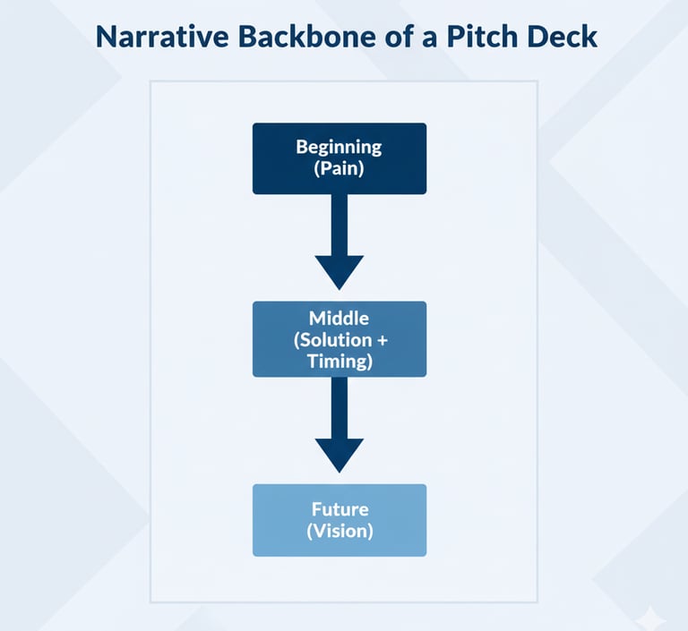
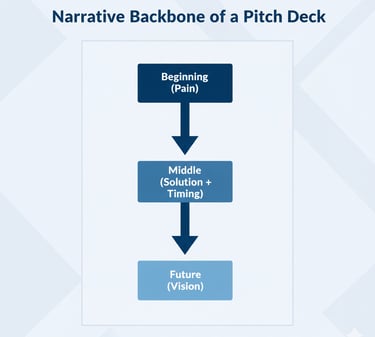
3. It Must Create Momentum (A Beginning → Middle → Future Arc)
A strong spine moves like a story:
Beginning (Pain):
Something is broken.
Middle (Solution + Market Timing):
Here’s how the world is shifting.
Future (Vision):
Here’s what the world looks like with us in it.
Weak decks have no spine, so they:
✘ jump around
✘ create confusion
✘ feel tactical, not strategic
✘ lose investor attention
✘ fail partner advocacy
A spine creates a narrative backbone that every slide aligns with.
How the Narrative Spine Controls the Entire Deck Structure
Your spine determines:
✔ slide order
✔ language tone
✔ pacing
✔ what to remove
✔ how much detail to include
✔ how to frame traction
✔ how to justify timing
✔ how to articulate GTM
✔ how to frame competition
✔ how to present economics
Without a spine, even a good idea feels weak.
With a spine, even a simple idea feels powerful.
The spine is the difference between clarity and chaos.
The 5-Step Method to Discover Your Narrative Spine
Before writing your deck, answer these questions:
Step 1 — What is the unstoppable shift in your industry?
(Tech, behavior, cost, regulation, market fragmentation, etc.)
Step 2 — Why is this creating a painful bottleneck?
(Operational, economic, workflow, experience)
Step 3 — Why hasn’t this been solved before now?
(Timing unlock)
Step 4 — Why is your solution the logical evolution of the shift?
(Inevitability)
Step 5 — What future becomes possible when you win?
(Vision)
These five steps become your spine.
Once you have your spine, the deck builds itself.
Why Investors Value the Narrative Spine
VCs don’t invest in features.
They invest in:
✔ worldview
✔ timing
✔ inevitability
✔ category creation
✔ narrative clarity
A strong spine signals:
➡ high founder intelligence
➡ deep insight
➡ strategic thinking
➡ product clarity
➡ market understanding
➡ fund-thesis alignment
This is why the best founders spend more time discovering their spine than designing slides.
8 — Transition Slides: The Invisible Glue That Makes Your Deck Feel Professional
(How World-Class Decks Maintain Flow Without Adding Extra Slides)
If the Narrative Spine (Section 7) is the backbone of your pitch deck…
then Transition Slides are the connective tissue that keeps the entire body moving smoothly.
Most founders don’t even know transition slides exist.
But investors feel the difference instantly:
✔ Smooth transitions = “This founder thinks clearly.”
✔ Clunky transitions = “This founder is not fundable yet.”
Transition slides are not separate slides.
They are micro-bridges — subtle narrative handoffs that:
pull the story forward
reveal intent
reduce cognitive effort
create clarity
lower investor resistance
prepare the brain for the next idea
You can think of them as the “scene transitions” in great films.
You don’t consciously notice them —
but without them, the movie feels chaotic.
Most amateur decks feel like hard cuts.
Professional decks feel like smooth scenes blending into each other.
Let’s unpack how this works.
Why Transition Slides Matter in 2025 (VC Cognition)
Investors make decisions fast — often within seconds, not minutes.
When the story has no transitions:
→ the brain resets on every slide
→ comprehension drops
→ trust drops
→ belief drops
→ the deck feels harder to follow
→ the founder appears inexperienced
Transition slides solve all of this by reducing the “mental reset” effect.
This is why decks used by top accelerators, big funds, and Series A+ founders always incorporate transitions — even if the slides look minimal.
The 3 Types of Transition Slides
Not all transitions are equal.
VC-ready decks use three distinct types.
Let’s break each one down.
1. Logical Transition Slides (“Because → Therefore”)
These occur when the end of a slide sets up the logic for the next slide.
Example:
Problem Slide ends with:
“…and teams are losing money, time, and operational capacity.”
Solution Slide begins with:
“Which is why we built a platform that automates the core bottleneck.”
This is the Because → Therefore bridge.
It feels natural, inevitable, and logical.
These slides dramatically improve the Lock-In Effect (Section 6).
2. Narrative Transition Slides (“Now let’s zoom out…”)
These transitions shift perspective and set up the next arc.
Example:
Between Solution → Why Now
“Now let’s zoom out for a moment. Why is this problem hitting peak urgency in 2025?”
Between Market → Product
“To understand how we serve this opportunity, let’s walk through how the product works.”
These slides reframe the narrative.
They prepare the investor’s brain for a new chapter.
This is sophisticated storytelling.
3. Momentum Transition Slides (“Proof → Credibility”)
These transitions happen when you jump from “theory” to “evidence.”
Example:
Between Product → Traction
“Now that you’ve seen how it works, here’s what real customers are doing with it.”
Between Traction → Business Model
“With validation established, let’s talk about how this becomes a scalable business.”
Momentum transitions create confidence and reduce risk.
They’re subtle, but extremely powerful.
How to Add Transition Slides Without Adding Extra Slides
Transition slides are rarely literal slides.
Instead, they are:
✔ top headers
✔ subhead lines
✔ final statement lines
✔ micro-bridges in the copy
✔ a one-sentence setup
✔ a visual with implied continuation
✔ structured whitespace
For example:
End of Market Slide:
“Given how fast this segment is accelerating, the question becomes: how do we serve it?”
Start of Product Slide:
“Here’s how our product captures that demand.”
This is smooth, professional, and partner-ready.
Why Weak Decks Have No Transitions
Founders who skip transitions appear to:
✘ jump too fast
✘ skip logic steps
✘ assume investor context
✘ overestimate clarity
✘ create cognitive friction
✘ break the narrative spine
✘ reduce partner confidence
One missing transition can derail an entire sequence.
This is why transition slides are one of the biggest differences between:
A deck that gets first meetings
vs.
A deck that gets partner meetings
Because transitions are where investors feel whether a founder thinks strategically.
The “Investor Flow Test” (How to Check If Your Deck Has Strong Transitions)
Ask someone to read your deck and answer one question:
“Did you ever feel lost, confused, or like the founder skipped something?”
If the answer is yes even once →
you have a transition problem.
Strong transitions = investors feel guided.
Weak transitions = investors feel abandoned.
This single concept dramatically improves your deck quality.


9 — Emphasis Hierarchy
(How to Make the Most Important Ideas “Pop” in a Way Investors Instantly Understand)**
Great pitch decks don’t just organize information correctly —
they emphasize the right information at the right moment.
This ability to emphasize what matters is one of the core signals VCs use to evaluate:
✔ founder clarity
✔ founder intelligence
✔ narrative prioritization
✔ market understanding
✔ communication skill
✔ execution potential
Most decks fail because they present everything with equal visual weight — making nothing stand out.
But investors don’t read decks linearly.
They scan for emphasis.
A strong emphasis hierarchy guides the investor’s eyes to the exact ideas you want them to internalize.
A weak emphasis hierarchy makes every slide feel noisy, unfocused, or amateur.
Let’s break down what emphasis hierarchy really means — and how founders can use it to make their decks look and feel “VC-native.”
Why Cognitive Emphasis Matters in Pitch Decks
The human brain cannot absorb equal-weight information.
It automatically prioritizes:
size
contrast
rhythm
placement
spacing
color focus
semantic importance
repeat value
If everything is bold → nothing is bold.
If everything is important → nothing is important.
Investors need a clear path through the slide.
This clarity subconsciously signals:
✔ strategic thinking
✔ design intelligence
✔ founder maturity
✔ storytelling mastery
✔ strong communication skills
And this dramatically increases investor trust.
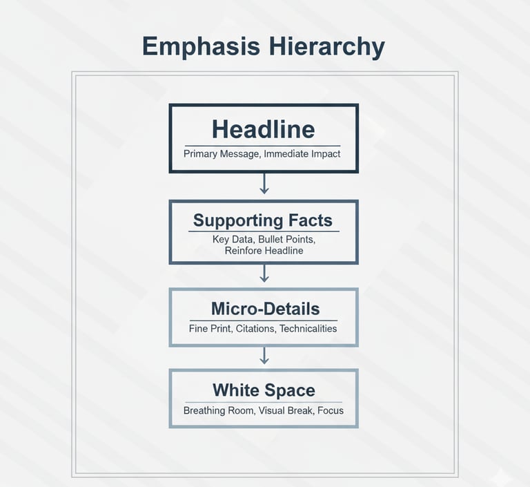
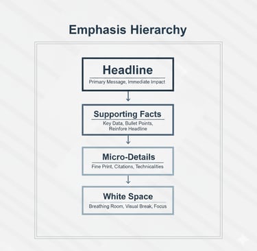
The 4 Layers of Emphasis Hierarchy (Used by Top-Tier Decks)
Every world-class pitch deck uses the same 4-layer emphasis system.
It’s subtle, but when mastered, it makes your deck look like it was built by a $10K pitch agency.
Layer 1 — The Slide Headline (“The Truth You Want Remembered”)
Your headline is the essence of the slide.
It must convey the “one belief” you want investors to internalize.
A strong headline is:
✔ short
✔ declarative
✔ insight-driven
✔ precise
✔ memory-friendly
Example:
Bad:
“Our market is growing fast.”
Great:
“5 million mid-market operators are hitting capacity limits in 2025.”
Headline = the narrative anchor of the slide.
Layer 2 — The Supporting Facts (The Proof)
This layer contains:
data
charts
workflows
examples
before/after snapshots
validation points
These elements reinforce the headline, but do NOT compete with it for attention.
This is where most founders go wrong — they highlight everything, which dilutes clarity.
Layer 3 — The Micro-Details (Optional Context)
These are:
footnotes
small bullet points
secondary metrics
context explanations
user behavior nuances
These should only be visible after the investor reads the headline + primary facts.
Micro-details should NEVER overtake the slide visually.
They exist purely to add depth for investors who want a slower read.
Layer 4 — White Space (The Invisible Emphasis Tool)
White space is not “empty space.”
It is a design tool that:
✔ directs investor focus
✔ breaks up cognitive load
✔ signals confidence
✔ improves readability
✔ elevates professionalism
Founders who use too much text eliminate white space and instantly make the deck feel “beginner level.”
This is why investors praise decks that feel “clean” or “tight.”
What they really mean is:
“The emphasis hierarchy is perfect.”
Why Emphasis Hierarchy Creates Investor Trust
Strong emphasis hierarchy communicates:
✔ strategic prioritization
✔ communication skill
✔ clarity of thought
✔ design intelligence
✔ focus on signal over noise
✔ ability to lead teams and investors
It subtly tells investors:
“This founder knows what matters.”
It also eliminates the #1 reason decks lose attention:
Cognitive fatigue caused by equal-weighted information.
A deck with a clear emphasis pattern feels easy to read —
and what feels easy to read feels easy to fund.
Because design without hierarchy is decoration,
but hierarchy without design is still persuasion.
How to Apply Emphasis Hierarchy to Every Slide (Practical Steps)
Here’s a simple rule you can use:
Rule 1: One idea gets the headline.
Rule 2: Three ideas get supporting detail.
Rule 3: Everything else gets micro-detail formatting.
This is how:
Place the slide thesis in the headline.
Put 2–3 insights as supporting points or visuals.
Move extra detail into footnote-level formatting.
Expand white space wherever the slide feels dense.
If you follow this structure, your deck will instantly feel:
✔ sharper
✔ more confident
✔ more readable
✔ more persuasive
✔ more fundable
Investors don’t want more information.
They want clearer information.
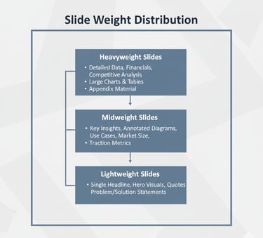
10 — Slide Weight Distribution
(How Much Each Slide Should “Matter” in the Investor’s Mind — And How to Control It)
Most founders assume every slide matters equally.
In reality, investors assign unequal cognitive weight to each slide — and this weighting system determines whether your story sticks or gets ignored.
A great deck distributes weight intentionally, making key slides feel heavier, more important, and more memorable… while keeping secondary slides lighter and more supportive.
This balance is the difference between:
✔ a pitch deck that feels sharp and strategic
and
✘ a pitch deck that feels bloated or chaotic
Slide Weight Distribution is one of the core signals VCs use to evaluate founder intelligence and narrative clarity.
If the “important” slides don’t feel important → your deck loses power.
If the “supporting” slides feel overwhelming → your deck loses flow.
Let’s break down how elite founders use this model.
Why Slide Weight Matters in VC Psychology
VCs don’t evaluate slides line-by-line.
They mentally assign weight based on four cognitive triggers:
Slide position (early slides = heavier)
Slide function (thesis vs. validation vs. detail)
Slide density (more info ≠ more importance)
Slide reinforcement (how many other slides support it)
The weight you assign creates the “hierarchy of belief” an investor forms.
This is why a deck can be structurally correct…
yet still feel “off,” “unbalanced,” or “unfinished.”
Slide weight — not slide count — determines narrative balance.
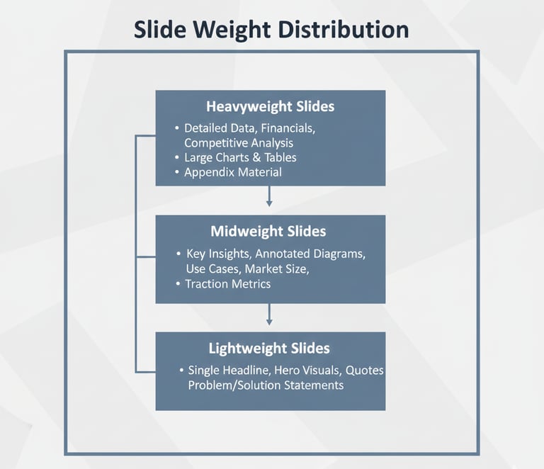
The 3 Categories of Slide Weight in a VC Pitch Deck
A world-class pitch deck always uses this specific weighting model.
1. Heavyweight Slides (The Investment Drivers)
These are the slides that determine 70–80% of investor conviction:
✔ Problem
✔ Solution
✔ Why Now
These slides contain your investment thesis.
They must feel:
✔ large
✔ spacious
✔ bold
✔ emotionally resonant
✔ high-signal
✔ belief-driving
Founders often waste visual space on these slides — packing them with details instead of clarity.
A heavy slide should feel light visually but heavy conceptually.
This is why elite decks always give these slides:
more white space
larger headlines
fewer details
higher emphasis
more structural room
These are the gravity slides of your pitch.
2. Midweight Slides (The Expansion Drivers)
These slides add scale and depth, but they’re not thesis-defining:
✔ Market
✔ Product
✔ Traction
Midweight slides must feel:
✔ informative
✔ logical
✔ contextual
✔ supportive
Not overwhelming, not soft, not filler.
This is where most founders overcomplicate — especially Product + Market.
Each midweight slide should only reinforce the foundation, not change it.
3. Lightweight Slides (The Risk Reducers)
These slides reduce anxiety:
✔ Business Model
✔ GTM
✔ Competition
✔ Team
✔ Ask
They are not persuasion slides —
they are validation slides.
Lightweight slides must:
✔ be clear
✔ be brief
✔ be structured
✔ avoid density
✔ avoid emotion
✔ avoid over-design
They exist to reduce objections, not to generate excitement.
Founders who accidentally make these slides “heavy” kill narrative flow and overwhelm investors.
The #1 Mistake Founders Make With Slide Weight Distribution
They give simple slides too much weight.
Examples:
❌ Traction slide with 20 metrics
❌ Competition slide with 12 columns
❌ Team slide with giant biographies
❌ GTM slide with 10 channels
❌ Business Model slide with full P&L logic
Overweighting these slides creates:
✘ cognitive fatigue
✘ loss of narrative energy
✘ investor confusion
✘ partner friction
✘ weaker internal pitchability
Investors don’t want more detail —
they want clearer distribution.
The Investor Experience When Weighting Is Perfect
When slide weight is properly balanced, investors feel:
✔ guided
✔ informed
✔ confident
✔ mentally relaxed
✔ emotionally aligned
✔ able to “believe” faster
This is why professionally structured decks feel:
➡ Cohesive
➡ Polished
➡ Strategic
➡ “Easy to fund”
It’s not design —
it’s distribution of weight.
How to Implement Slide Weight Distribution (Simple Rule)
Here’s the “3–2–1 Rule” used by top-tier pitch designers:
3 Heavy Slides
(Problem, Solution, Why Now)
2 Midweight Slides
(Market, Product)
1 Supporting Slide per category
(Traction, GTM, Business Model, Team, Ask)
This creates perfect flow.
Add more than 1 slide per category → the deck bloats.
Add fewer → the deck loses clarity.
This rule is used in hundreds of successful raises.
11 — The Rhythm of Reveal
(How to Control the Speed, Timing, and Emotional Beats of Your Pitch Deck Narrative)
Even if your deck has perfect slide order…
and perfect slide weight…
and perfect transitions…
It can still fail if you get one thing wrong:
👉 The Rhythm of Reveal — the pacing of how information unfolds across your slides.
Think of your pitch deck like a premium documentary:
The sequence is important, but so is timing.
If you reveal ideas too early → investors feel overwhelmed.
If you reveal ideas too late → investors feel frustrated or confused.
If you reveal ideas too quickly → investors feel rushed.
If you reveal ideas too slowly → investors lose energy.
Mastering the Rhythm of Reveal transforms your deck from:
✘ “informational”
into
✔ “compelling”
This is what makes investors say:
“The pitch just felt… right.”
Great decks reveal information with precision timing.
Weak decks dump information without pacing.
Let’s break down how to control this rhythm like a pro.
Why Pacing Matters in VC Psychology
The brain can only absorb new information at a limited rate.
When a founder controls the pace of reveal, investors experience:
✔ lower cognitive load
✔ stronger comprehension
✔ rising curiosity
✔ sustained momentum
✔ reduced resistance
✔ smoother belief formation
A pitch deck is not just a file —
it’s a tempo.
The goal is to keep the investor in a:
➡ state of constant understanding
➡ with rising anticipation
➡ without ever feeling lost
This is where great founders outperform.
The 3 Types of Reveal Timing in a VC Pitch Deck
Top founders use three specific pacing styles to control the emotional and cognitive flow of the deck.
1. The Early Reveal (Slides 1–3)
“Give investors clarity early so they trust you.”**
The beginning of the deck requires:
✔ clear thesis
✔ bold framing
✔ immediate insight
✔ simplicity
✔ narrative force
This is why Problem → Solution → Why Now must happen early and with emphasis.
If early slides feel vague, soft, or slow…
your deck loses momentum before it even begins.
Elite founders give investors direction immediately.
This is where “spine clarity” matters most.
2. The Delayed Reveal (Slides 4–6)
“Give investors depth only after they accept the thesis.”**
Once investors understand the thesis, they’re ready for:
✔ market logic
✔ product clarity
✔ traction foundation
This is where founders must avoid the biggest pacing mistake:
Dumping too much too fast.
Great delayed reveals:
✔ build tension
✔ increase curiosity
✔ reward comprehension
✔ deepen belief
By pacing information gradually, you create the feeling:
“The more I read, the more this makes sense.”
This delayed reveal style appears heavily in structured deck frameworks like the sequencing shown in Pillar 1 → https://fundingblueprint.io/how-vc-pitch-decks-work, where insight unfolds step-by-step.
3. The Late Reveal (Slides 7–12)
“Give investors risk reduction after belief is already formed.”
Late slides introduce:
✔ business model clarity
✔ GTM logic
✔ competition
✔ team
✔ financial sanity
✔ the ask
These slides are NOT designed to create excitement.
Their job is to remove objections — quietly.
They must be:
✔ lightweight
✔ simple
✔ reassuring
✔ structured
✔ low-density
This is like a plane landing:
smooth, predictable, controlled.
A perfect late reveal makes investors feel:
“I see no red flags — I can pitch this internally.”
The Emotional Beat Pattern of a Perfect Pitch
A powerful pitch deck follows this emotional rhythm:
1. “Interesting.”
(Problem)
2. “Makes sense.”
(Solution)
3. “Why now? Oh, that’s compelling.”
(Timing)
4. “Okay, this is big…”
(Market)
5. “This actually works.”
(Product)
6. “Customers care.”
(Traction)
7. “The economics make sense.”
(Business Model)
8. “This team can execute.”
(Team)
9. “Here’s exactly what they need.”
(Ask)
If you get this sequence and timing right,
the pitch becomes an emotional journey.
Investors don’t just understand your business —
they feel aligned with it.
The #1 Reason Founders Fail at Rhythm
(And How to Fix It)
They reveal the wrong thing at the wrong time.
Examples:
❌ revealing traction too early → feels defensive
❌ revealing team too early → feels ego-driven
❌ revealing competition too early → feels insecure
❌ revealing GTM too early → feels premature
❌ revealing economics too early → feels theoretical
The Rhythm of Reveal fixes all of this.
It ensures information lands at the exact moment the investor is psychologically ready for it.
When the rhythm is right, investors stay fully inside your narrative.
When the rhythm is wrong, they disconnect.
How to Perfect the Rhythm of Reveal (The 15-Second Scan Test)
Have someone scan your deck for 15 seconds.
Ask:
“Did the information unfold in a way that felt natural and satisfying?”
If the answer is anything but “yes,”
your pacing needs recalibration.
This is one of the most important refinements founders make before fundraising.


12 — Slide Density Management
(How Much Content Each Slide Should Contain — And the Hidden Threshold Where VCs Stop Reading)**
Even if your slide order is perfect…
and your transitions are smooth…
and your narrative is intelligent…
Your pitch can STILL fail if your slide density is wrong.
Slide Density refers to:
✔ how much text
✔ how many visuals
✔ how many data points
✔ how many concepts
✔ how much structure
✔ how much “stuff”
…you place on a single slide.
Density determines:
➡ readability
➡ pacing
➡ cognitive load
➡ investor attention
➡ investor retention
➡ perceived founder intelligence
Most founders get this completely wrong.
They either:
❌ overload slides (making the deck feel chaotic)
or
❌ underload slides (making the deck feel shallow or naive)
But elite founders master density like a science.
Let’s break this down.
Why Slide Density Matters in VC Psychology
Investors are not reading your deck word by word.
They are scanning for clarity, and they make micro-judgments in seconds.
High-density slides create:
✘ overwhelm
✘ confusion
✘ cognitive fatigue
✘ subconscious distrust
✘ “this founder is disorganized” perception
Low-density slides create:
✘ lack of credibility
✘ lack of depth
✘ lack of insight
✘ “this founder hasn’t thought deeply” perception
But optimal density creates:
✔ clarity
✔ confidence
✔ comprehension
✔ trust
✔ narrative momentum
The brain LOVES the right density —
and rejects the wrong one instantly.
The Optimal Slide Density Framework (Used by Top Pitch Agencies)
There are three density levels used in world-class pitch decks.
Each slide must belong to ONE of these three — never in-between.
1. Low-Density Slides (Conceptual Slides)
Ideal for:
✔ Problem
✔ Solution
✔ Why Now
✔ Vision
These slides must:
✔ have large whitespace
✔ be insight-heavy
✔ have few words (max 10–18)
✔ feel emotionally powerful
✔ give the brain space to absorb
Low-density slides are the “persuasion slides.”
They carry emotional and strategic weight.
Founders often sabotage these slides by adding:
❌ too much text
❌ multiple ideas
❌ product features
❌ unnecessary visuals
Low-density slides must feel crisp and inevitable.
2. Medium-Density Slides (Validation Slides)
Ideal for:
✔ Market
✔ Product
✔ Traction
These slides should:
✔ contain 2–3 key insights
✔ include a chart or visual
✔ maintain readability
✔ reinforce logic without overwhelming
✔ show grounded thinking
These slides bridge the gap between:
belief → proof
Too much density → feels academic.
Too little density → feels weak.
The sweet spot is 2 insights + 1 visual.
You’ll see this pattern consistently in well-structured decks, including examples found inside the Pitch Deck Guide → https://fundingblueprint.io/vc-pitch-deck-guide, which uses medium density for all validation slides.
3. High-Density Slides (Appendix-Only Slides)
Ideal for:
✔ Extended financials
✔ Operational models
✔ Detailed GTM
✔ Technical architecture
✔ Multi-step workflows
✔ Research citations
High density belongs only in the appendix —
never in the main deck.
High-density slides serve one purpose:
➡ satisfy highly analytical investors who want more depth
But they must NEVER be shown during the pitch.
High-density content during the core narrative disrupts rhythm, pacing, and belief formation.
The 7–Second Density Scan (Used by VCs)
A partner will often glance at a slide and — within 7 seconds — decide:
✔ “This is clear”
or
✘ “This is too much”
If it’s “too much,” they:
→ skim
→ skip
→ disengage
→ downgrade you mentally
This effect happens subconsciously.
Founders rarely notice it —
but investors always feel it.
Density Kills or Elevates the Narrative Spine
Everything you’ve built so far:
✔ the causality chain
✔ the narrative spine
✔ the transitions
✔ the rhythm
✔ the sequencing
✔ the logic flow
…can collapse instantly if your slides are too dense.
Density interrupts:
➡ momentum
➡ comprehension
➡ belief
➡ pacing
If you’ve ever heard an investor say:
“This deck feels heavy…”
…they’re talking about density, not design.
Density Guidelines for Each Slide Type (Copy This)
The ideal density per slide is:
Problem = Low (10–18 words max)
Solution = Low (1 sentence + visual)
Why Now = Low/Medium (1–2 insights)
Market = Medium (chart + insight)
Product = Medium (micro-flow + impact)
Traction = Medium (1 metric + 1 chart)
Business Model = Medium/Low (clean 2-part model)
GTM = Medium (3 steps)
Competition = Medium (simple matrix)
Team = Low (headline + roles)
Ask = Low (clear numbers)
Appendix = High Density allowed only here.
This is the density standard investors expect in 2025.
How to Check If Your Deck Has Optimal Density
Use this simple test:
“Does this slide make me inhale deeply when I look at it?”
If yes → it’s too dense.
If the slide:
✔ feels readable
✔ feels breathable
✔ feels balanced
✔ communicates quickly
✔ tells exactly ONE idea
…then the density is perfect.
This is the easiest high-impact improvement most founders can make.


13 — Narrative Redundancy
(How to Repeat Key Ideas Without Sounding Repetitive — So Investors Remember Your Message)
Most founders avoid repetition because they fear sounding unprofessional.
But world-class communicators — including top CEOs, fund managers, and master storytellers — use structured redundancy as a persuasion weapon.
Narrative Redundancy does not mean repeating the same words.
It means:
✔ reinforcing your core ideas
✔ from different angles
✔ through different lenses
✔ in a progressive sequence
✔ until the investor internalizes the message
Why?
Because investors don’t remember slides.
They remember:
➡ patterns
➡ repeated themes
➡ consistent logic
➡ reinforced beliefs
The human brain naturally filters out information that appears once.
It internalizes information that appears three times from different angles.
Founders who understand this win meetings.
Founders who don’t look “messy” or “unclear.”
Let’s break it down.
Why Narrative Redundancy Works (Cognitive Science)
Repetition is a core principle of memory formation.
The more frequently the investor sees:
✔ the same problem
✔ framed differently
✔ with consistent logic
…the more they believe the problem is:
➡ real
➡ structural
➡ industry-wide
➡ painful
➡ urgent
This is why great decks echo certain messages across multiple slides.
Not copy-paste repetition —
framed repetition.
Let’s look at the three forms.
The 3 Forms of Narrative Redundancy Used in Winning Decks
Elite decks use redundancy in three sophisticated ways.
1. Structural Redundancy (Slide-to-Slide Consistency)
This is repetition inside the deck structure.
Examples:
Problem slide:
“Exception-handling bottlenecks slow operations.”
Solution slide:
“We eliminate the exception-handling bottleneck.”
Why Now slide:
“Exception-handling is growing 2× due to workflow fragmentation.”
Same message → new angle.
This reinforces inevitability.
2. Contextual Redundancy (Concept in Different Contexts)
You repeat the same idea but place it in different sections.
Example:
Market slide:
“The industry spends $28B on solving this bottleneck.”
Traction slide:
“Early customers adopted us specifically because of this bottleneck.”
Product slide:
“Our wedge product targets the bottleneck first.”
3. Emotional Redundancy (Reinforcing the Feeling)
This is subtle.
You repeat the emotional impact, not the facts.
Examples:
Problem slide:
“Teams are overwhelmed.”
Solution slide:
“Teams regain control instantly.”
Traction slide:
“Teams report operational calm within days.”
Same emotion → different data → investor alignment.
The Difference Between Smart Redundancy and Bad Repetition
Smart redundancy is:
✔ intentional
✔ refreshing
✔ angle-shifting
✔ logic-building
✔ strategic
✔ subtle
Bad repetition is:
✘ copy-paste text
✘ redundant phrasing
✘ bloated content
✘ identical visuals
✘ predictable wording
✘ filler
The key difference:
Smart redundancy expands the idea.
Bad redundancy repeats the idea.
Why Narrative Redundancy Is Essential for Partner-Level Pitching
Partners must pitch your startup internally.
If you don’t give them reinforced talking points:
→ they forget
→ they mix up details
→ they mis-pitch your idea
→ the deal weakens
→ IC loses conviction
Redundancy makes your pitch:
✔ easy to remember
✔ easy to summarize
✔ easy to defend internally
✔ easy to champion
Partners love founders who give them sticky ideas.
Narrative redundancy makes your ideas sticky.
Where to Apply Redundancy (Blueprint)
Here’s where founders should repeat strategically:
✔ The central problem → 3 times
✔ The core wedge → 2 times
✔ The Why Now → 2 times
✔ The traction insight → 2–3 times
✔ The macro trend → 2 times
✔ The economic logic → subtly spread across Business Model + Traction
This is how you create a pitch that investors remember after 200+ other decks.
When Redundancy Goes Wrong (Investor Red Flags)
Redundancy hurts you when it:
❌ appears in the same phrasing
❌ adds no new perspective
❌ feels like filler
❌ is used to hide weak thinking
❌ makes your slides too dense
❌ becomes predictable
The secret is angle-based redundancy, not textual repetition.
The Investor Experience When Redundancy Is Done Perfectly
When narrative redundancy is strong, investors feel:
✔ confidence building
✔ logic reinforcing
✔ momentum increasing
✔ narrative becoming inevitable
✔ belief compounding
This is one of the biggest reasons top-tier decks feel irresistible.
They don’t just explain the idea.
They embed the idea in the investor’s mind.


14 — The Layering Method
(How Elite Founders Add Depth Without Complexity — And Make Their Slides Feel “Smart, Not Dense”)
Most founders try to impress investors by adding more content.
Elite founders impress investors by adding more layers — without adding clutter.
This is the Layering Method:
the art of embedding depth into your slides without overwhelming the investor’s brain.
Think of your pitch deck like a luxury product:
✔ clean on the surface
✔ powerful underneath
✔ layered strategically
✔ intuitive at first glance
✔ deep on inspection
The Layering Method makes your deck feel:
✔ intelligent
✔ mature
✔ strategic
✔ founder-smart
✔ investor-friendly
And most importantly:
➡ It lets investors discover depth instead of struggle with it.
Let’s break down how world-class founders layer information like pros.
Why Layering Matters in VC Psychology
Investors don’t want:
✘ dense slides
✘ clutter
✘ over-detailed logic
✘ long explanations
✘ multi-paragraph walls of text
But they do want:
✔ evidence
✔ thoughtfulness
✔ depth
✔ analysis
✔ insight
✔ maturity
Layering solves this paradox.
It allows you to hide depth behind simplicity.
This is why decks from top-tier accelerators, premium pitch agencies, and top-performing founders always “feel” smart — even before you read a single word.
The depth is there…
just not on the surface.
The 3 Layers Found in Every VC-Native Slide
Every great slide contains exactly three layers — never more, never less.
Let’s break them down.
Layer 1 — The Surface Layer (What Investors See First)
This layer must be:
✔ simple
✔ bold
✔ declarative
✔ memorable
✔ obvious at a glance
This is your:
headline
large insight
main statement
primary visual
thesis sentence
Example:
“Exception-handling workflows waste 22% of operational capacity.”
Clean, bold, digestible.
This is what catches the investor’s attention during a 3-second scan.
Layer 2 — The Depth Layer (What Investors See Next)
This layer lives under the surface:
✔ supporting facts
✔ insights
✔ small charts
✔ context
✔ visual explainer
✔ comparison logic
It adds credibility without overwhelming.
This layer says:
“We didn’t make this up. Here’s proof.”
Great founders never overload this layer.
It remains tight and specific — usually 2–3 supporting elements.
Layer 3 — The Optional Depth Layer (For Analytical Investors)
This layer is subtle:
It’s “there if you look, but not loud.”
Examples:
✔ small footnotes
✔ micro-data labels
✔ secondary metric context
✔ workflow detail
✔ short annotation
✔ tiny metadata
✔ underlying assumptions
This layer allows investors who want deeper insight to see more —
but without disturbing the flow of the slide.
This gives your deck:
➡ surface-level simplicity
➡ mid-level credibility
➡ deep-level intelligence
It’s a psychological masterpiece when done well.
Why Layering Makes Investors Trust You Instantly
Layered slides communicate:
✔ you think like an operator
✔ you understand information architecture
✔ you speak in structured logic
✔ you respect cognitive load
✔ you prioritize clarity
✔ you know how to lead through communication
Investors subconsciously interpret layering as high founder IQ —
because layering requires:
precision
discipline
understanding
narrative control
maturity
Amateur founders dump information.
Elite founders layer information.
How to Apply Layering in Practice (Copy This Template)
Use this 3-part template for every slide:
1. Surface Layer (1 Sentence)
Your thesis or primary insight.
2. Depth Layer (2–3 Supporting Elements)
Examples:
• chart
• small bullets
• workflow
• metric
• visual comparison
• simple timeline
3. Optional Layer (Micro-Details)
Examples:
• footnotes
• small labels
• clarifying note
• secondary metric
• subtle annotation
This creates slides that feel:
✔ rich but not heavy
✔ smart but not dense
✔ confident but not busy
✔ polished but not cluttered
This is exactly how pitch agencies charge $10K for decks — by mastering the art of layering.
The Founder Test (To Check Your Layer Quality)
Ask yourself:
“Can an investor understand the slide in 3 seconds…
but still find meaningful depth if they look closely for 10 seconds?”
If yes → your layering is perfect.
If no → revise until this is true.
This single test dramatically improves the perceived quality of your deck.


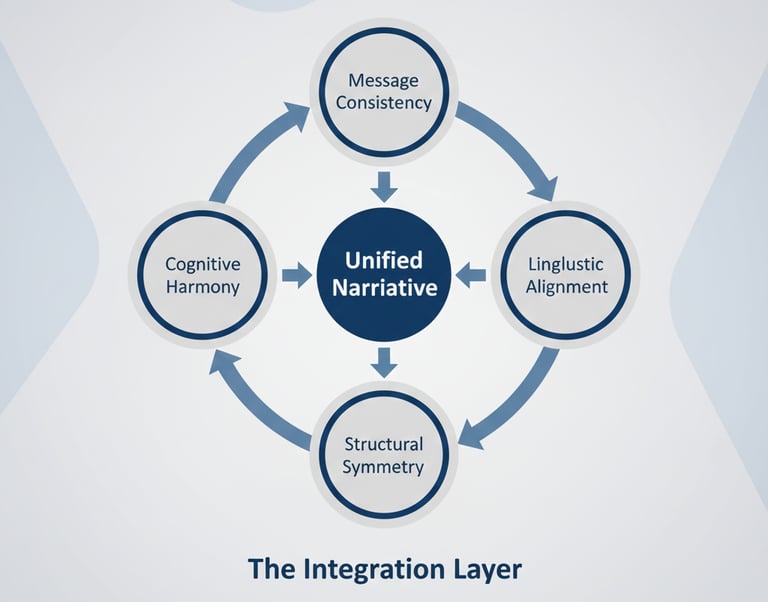
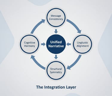
15 — The Integration Layer
(How All Slide Principles Combine Into One Persuasive, High-Conviction Investment Narrative)**
You now understand every major structural element of a VC pitch deck:
✔ slide hierarchy
✔ causality chain
✔ lock-in effect
✔ narrative spine
✔ transitions
✔ rhythm of reveal
✔ emphasis hierarchy
✔ density management
✔ layering
✔ redundancy
But the most important thing is this:
👉 None of these elements matter unless they integrate into one unified narrative system.
This final concept — The Integration Layer — is what separates:
“Nice deck.”
from
“This is a fundable company.”
The Integration Layer is what makes a pitch deck feel like:
✔ one voice
✔ one argument
✔ one logic chain
✔ one worldview
✔ one investment thesis
Instead of:
✘ a collection of slides
✘ a scattered set of ideas
✘ disconnected insights
✘ mixed founder maturity
✘ inconsistent tone
Let’s unpack how elite founders create Integration.
What Is the Integration Layer? (VC Definition)
The Integration Layer is the unifying force that makes the deck coherent.
It is NOT:
❌ a slide
❌ a design choice
❌ a headline
❌ a story trick
❌ a template
It is the internal logic of your entire deck.
VCs describe decks with strong integration like this:
“Everything connects.
Everything reinforces.
Everything feels intentional.”
Decks with weak integration — even well-designed ones — get described as:
“Something feels off.”
Investors can’t always articulate the problem.
But they can feel when the integration is broken.
The 4 Components of a Strong Integration Layer
There are four invisible mechanisms working underneath every world-class deck.
1. Message Consistency (The Story Never Breaks)
Your deck must express the same worldview across:
✔ Problem
✔ Solution
✔ Timing
✔ Market
✔ Product
✔ Traction
✔ Economics
✔ Team
✔ Ask
For example:
If your thesis is:
“Operational fragmentation is exploding.”
Then every slide must reinforce fragmentation:
→ Problem: fragmentation causes cost & confusion
→ Solution: reduces fragmentation
→ Why Now: fragmentation is accelerating
→ Market: fragmentation is a $X billion opportunity
→ Product: focuses on reducing fragmentation
→ Traction: customers adopt due to fragmentation pain
This is the core of integration.
One narrative → many slides → one worldview.
2. Linguistic Alignment (The Brain Detects Contradictions Instantly)
Investors subconsciously track your word choices.
If you say:
“mid-market operators are overwhelmed”
But later you say:
“operators are growing steadily”
— the integration breaks.
Your language must:
✔ match
✔ echo
✔ repeat
✔ reinforce
✔ never contradict
3. Structural Symmetry (Slide Logic Mirrors Itself)
Every slide must “fit” into the overall architecture.
If your deck is built on:
Problem → Solution → Timing → Market → Product → Traction → Business Model → Team → Ask
Then:
→ no slide should feel “out of place”
→ no slide should break the flow
→ no slide should contradict pacing
→ no slide should feel visually alien
Symmetry makes decks feel “premium.”
Asymmetry makes them feel scrappy and unpolished.
4. Cognitive Harmony (The Investor Never Feels Confused)
A fully integrated deck makes the investor feel:
✔ safe
✔ guided
✔ intellectually respected
✔ emotionally aligned
✔ convinced
✔ calm
✔ clear
✔ trusting
That emotional state — calm belief — is what makes partners say:
“I get it. This is fundable.”
The Integration Layer creates harmony between:
content → design → pacing → emphasis → clarity → belief
That harmony is the final stage of mastery.
Why The Integration Layer Is What Separates Good Decks From Funded Decks
VCs are not investing in your slides.
They are investing in your:
✔ clarity
✔ worldview
✔ thinking process
✔ narrative intelligence
✔ communication maturity
✔ ability to lead
✔ ability to persuade
✔ ability to raise future rounds
The deck is a proxy for your founder competence.
A deck with strong integration signals:
→ “This founder thinks clearly.”
→ “This founder understands systems.”
→ “This founder can communicate complexity.”
→ “This founder can lead teams and investors.”
Integration = founder quality.
How to Build Your Integration Layer (Method Used by $10K Deck Agencies)
Here is the exact workflow:
Step 1 — Extract your Core Thesis
(Unearth the single sentence the entire deck revolves around.)
Step 2 — Align every slide with the thesis
(If any slide doesn’t reinforce the thesis → rewrite it.)
Step 3 — Unify the language
(Keep phrasing consistent across all slides.)
Step 4 — Tighten the transitions
(Ensure every slide causes the next slide.)
Step 5 — Unify the pacing
(Perfect Rhythm of Reveal.)
Step 6 — Ensure proportional weighting
(Heavy → Mid → Light distribution.)
Step 7 — Enforce density discipline
(No slide should feel heavy unless it’s supposed to.)
Step 8 — Add redundancy strategically
(Reinforce your thesis 3 cores times.)
Step 9 — Final scan for contradictions
(Your narrative must be logically airtight.)
This 9-step Integration process turns an “okay” deck into an investor-ready deck.
The Investor Experience When Integration Is Perfect
Investors feel:
✔ clarity
✔ certainty
✔ trust
✔ narrative immersion
✔ belief in inevitability
✔ alignment with timing
✔ emotional connection
✔ logical conviction
This is why integrated decks perform dramatically better in:
→ first meetings
→ partner meetings
→ IC
→ follow-on conversations
→ diligence
Integration ≠ polish.
Integration = persuasion
📘 In-depth Guides: Pitch Deck Structure, Slides & Frameworks
Below are focused, judgment-driven breakdowns that examine how venture capital investors interpret pitch deck structure — not as a formatting exercise, but as a signal of founder thinking, prioritization, and execution maturity.
Each guide expands one structural dimension investors repeatedly evaluate when deciding whether a deck feels investable or fragile.
SUB-PILLAR 1: Core Pitch Deck Structures
How VCs recognize strong structural patterns, and why certain deck structures consistently outperform others.SUB-PILLAR 2: Slide Order & Logical Flow
How investors assess sequencing, momentum, and narrative logic across slides.SUB-PILLAR 3: Slide-by-Slide Mastery (Deep Dives)
What investors expect each slide to accomplish — and how weak slides undermine the whole deck.SUB-PILLAR 4: Famous Pitch Deck Frameworks
How well-known frameworks are actually used (and misused) in real investor reviews.SUB-PILLAR 5: Industry-Specific Deck Structures
Why SaaS, marketplaces, biotech, and fintech decks follow different structural rules.SUB-PILLAR 6: Narrative Frameworks for Decks
How storytelling frameworks influence investor memory, conviction, and internal advocacy.SUB-PILLAR 7: Alternative Deck Formats
When non-standard structures help — and when they silently hurt credibility.SUB-PILLAR 8: Structural Mistakes & How to Fix Them
Common structural errors investors see repeatedly, and how strong founders correct them.SUB-PILLAR 9: Templates, Tools & Best Practices
How investors evaluate structure regardless of templates, tools, or slide software.
FAQ — Slide Structure & Frameworks (Pillar 3)
15 High-Authority, SEO-Optimized Questions
1. What is the correct order of slides in a VC pitch deck?
The standard modern flow is:
Problem
Solution
Why Now
Market
Product
Traction
Business Model
GTM
Competition
Team
Ask
Appendix
This order follows the investor cognitive sequence, ensuring each slide logically causes the next.
Deviating from this order usually breaks the causality chain and weakens investor belief.
2. How many slides should a pitch deck have in 2025?
The optimal range is 10–12 core slides plus appendix slides for deeper detail.
More than 14 core slides → too heavy.
Fewer than 9 → too shallow.
Appendix slides (high-density slides) are encouraged because they show depth without slowing down the main narrative.
3. How long should each slide take to read?
Investors typically spend:
✔ 3–5 seconds on heavy thesis slides
✔ 5–8 seconds on validation slides
✔ 2–3 seconds on lightweight slides
If a slide takes longer than 10 seconds to understand, the density is too high.
4. How much text should be on a slide?
Use these density rules:
Low-density: 10–18 words
Medium-density: 2–3 insights
High-density: appendix only
If you need more text than that, the slide is trying to do too much.
5. Should the Problem and Solution slides be visually simple?
Yes — the simpler the slide, the stronger the emotional impact.
A cluttered Problem or Solution slide instantly signals:
✘ unclear founder thinking
✘ lack of narrative discipline
✘ low storytelling skill
These slides must be low-density and high-conviction.
6. What makes a slide feel “VC-native”?
A VC-native slide has:
✔ clear hierarchy
✔ clean spacing
✔ single slide thesis
✔ visual-supporting logic
✔ minimal text
✔ strong narrative anchor
✔ intelligent layering
This structure mirrors how partners evaluate deals.
7. How many charts should a pitch deck include?
Typically 2–3 charts:
Market size (TAM/SAM/SOM or segmented growth)
Traction (ARR, users, retention, pipeline)
Unit economics (appendix only)
Avoid more than 3 charts in the core deck — it increases cognitive load.
8. Should I put financial projections in the main deck?
No.
Financial projections belong in the appendix, not the core deck.
Why?
Projections trigger:
→ analytical scrutiny
→ defensive questions
→ early skepticism
Keep the main deck narrative-focused and put deep financial modeling in the appendix or link to a downloadable version.
9. How do I show traction early-stage (pre-revenue)?
Use alternative traction signals:
✔ waitlists
✔ pilots
✔ partnerships
✔ LOIs
✔ usage metrics
✔ engagement
✔ retention
✔ workflow adoption
✔ team hires (for AI/ML startups)
✔ customer development insights
Traction is proof of demand, not just revenue.
10. Should the deck mention competitors?
Yes — every investor expects it.
But the competition slide must be:
✔ simple
✔ factual
✔ strategic
✔ confident
And NEVER framed negatively.
Competition validates the market.
11. Should the Team slide go early or late?
Always late — usually slide 9 or 10.
If the team slide comes early, it creates:
✘ ego signaling
✘ narrative disconnect
✘ premature evaluation
Place the team slide after all structural logic has been established.
12. Do I need an appendix in a fundraising deck?
Yes — every serious deck includes one.
Your appendix should contain:
detailed economics
GTM depth
extended traction
operational logic
LTV/CAC breakdown
product architecture
roadmap
Appendix = depth.
Main deck = persuasion.
13. Should I include product screenshots?
Only if:
✔ they are clean
✔ they communicate workflow
✔ they visually support the solution
NOT if they create clutter or distract from the narrative.
A single 3-step micro-flow often works better than raw screenshots.
14. Is it okay to use templates for pitch deck slides?
Yes — but ONLY if you customize structure, pacing, emphasis, and narrative.
Templates solve design.
Narrative frameworks solve persuasion.
This is why investors prefer story-rooted systems like our VC PITCH DECK blueprint because it integrates messaging, structure, hierarchy, pacing, and founder psychology into the templates.
15. Should my pitch deck match my verbal pitch?
No — and yes.
Your verbal pitch adds story, personality, and improvisation.
Your deck is a structured argument.
They must be consistent in:
✔ core thesis
✔ timing logic
✔ traction narrative
✔ market insight
But your verbal pitch should NEVER be a slide-by-slide reading of the deck.
16. How long should investors spend reading my deck?
Average partner-level read time:
➡ 3–4 minutes
If your deck takes longer, it’s too dense.
If it takes less, it might be too shallow.
17. Should I include a “Vision” slide?
Yes — but ONLY if it is:
✔ 1 sentence
✔ future-facing
✔ believable
✔ aligned with the Problem + Solution
Avoid abstract, poetic vision statements.
Investors want pragmatic vision, not manifesto energy.
18. Should I show pricing on my Business Model slide?
Yes — simple pricing anchors help investors understand:
✔ positioning
✔ margin potential
✔ ICP behavior
✔ sales model
Keep it to:
➡ 1 headline price
➡ 1–2 supporting tiers
➡ optional appendix details
Over-detailing pricing hurts your pitch.
If You Want the Shortcut
You now understand the full structural science behind a world-class, investor-ready pitch deck.
And you can absolutely build it yourself using the 15 frameworks above.
But if you want to skip the 40–120 hours of rewriting,
avoid the structural errors most founders make,
and get a system already used by founders who’ve raised over $40M+,
then the next step is simple:
🎯 The Funding Blueprint — Your Complete VC Pitch Deck System
The Funding Blueprint gives you:
✔ A fully structured, VC-native pitch deck
✔ A high-conviction narrative flow built on 2025 investor psychology
✔ A proven Problem → Solution → Timing architecture
✔ Slide-by-slide frameworks and ready-to-use templates
✔ A VC-level Business Model, GTM, and Traction structure
✔ A startup financial system inspired by Uber, Airbnb & 4 unicorn giants
✔ A design-ready deck built for clarity, pacing, and persuasion
✔ Every framework you learned in this pillar — pre-built
✔ A complete founder messaging system
✔ And an AI pitch analyzer to stress-test your narrative
This is the same system hundreds of founders apply when they need to look:
✔ credible
✔ fundable
✔ structured
✔ ready for partner review
— without hiring a $3,000–$5,000 pitch consultant.


+650
+40M
collectively raised $40 Million+
Startup Founder Team
A step-by-step, founder-friendly guide covering everything you need to build a high-converting pitch deck that wins investor meetings, earns trust, and helps you raise capital confidently.
The Complete Guide to Pitch Decks (VC, Startup & Investor Decks) – 2025
VC Pitch Deck Academy — 12 Pillars
Pillar 1 — How VC Pitch Decks Really Work
Pillar 2 — Problem & Solution Slides
Pillar 3 — Slide Structure & Frameworks (This Page)
Pillar 4 — Investor Psychology (NEXT)
Pillar 5 — Storytelling & Narrative
Pillar 6 — Design Principles
Pillar 7 — Traction & Metrics
Pillar 8 — Market Size & Competition
Pillar 9 — Fundraising Strategy
Pillar 10 — Pitch Delivery
Funding Blueprint
© 2025 Funding Blueprint. All Rights Reserved.