Design & Formatting Mistakes: The Visual Trust Audit
Design Mistakes: Amateur slides trigger the "Scam Filter" instantly. Master the Visual Trust Audit and "Cognitive Load" protocols to signal elite status in 2026.
PILLAR 11 : MISTAKES, RED FLAGS & INVESTOR JUDGMENT
1/8/20268 min read
Design & Formatting Mistakes: The Visual Trust Audit
Ugly Decks Get Read. Confusing Decks Get Deleted.
There is a prevalent, dangerous myth in the startup ecosystem that high-design, "pixel-perfect" pitch decks are the key to raising capital. Founders spend thousands of dollars on graphic designers to create slides that look like marketing brochures or Apple keynotes. This is a fundamental capital allocation error.
A deck designed like a marketing brochure often signals a founder who prioritizes flash over function—a "Style over Substance" red flag. Conversely, a deck that looks like a dense PhD thesis signals an inability to prioritize information—a "Lack of Focus" red flag.
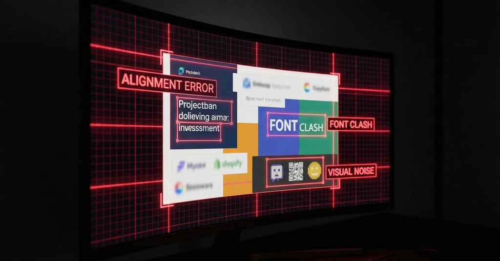
In the world of elite Venture Capital, design is not about aesthetics; it is about Information Architecture. Your typography, your spacing, your grid systems, and your hierarchy are proxy metrics for your Operational Grip. If you cannot align three text boxes on a slide, the investor subconsciously assumes you cannot align a sales team. If your font sizes are inconsistent, we assume your financial projections are equally undisciplined.
Misaligned kerning is not a design error; it is an operational signal. It suggests that you tolerate mediocrity in your output. When an investor reviews your deck, they are performing a "Visual Trust Audit." They are looking for "Metric Integrity" encoded in the layout. This guide breaks down exactly how to pass that audit.
This sub pillar is part of our main Pillar 11 : Mistakes, Red Flags & Investor Judgment
The Trench Report: The $11M Series A Pivot
Deal Context: Logistics SaaS (London/Berlin).
The Status: The company was fundamentally sound. They had $1.8M ARR, were profitable on a unit basis, and had zero churn in their enterprise cohort.
The Problem: Despite these "Unicorn-grade" metrics, the founder had received 12 consecutive "Pass" emails from Tier-1 funds in London and New York.
The Feedback: "We struggled to find the conviction in the model."
The Forensic Diagnosis:
We performed a forensic audit of the deck. The founder, an ex-Management Consultant, was using a "Consultant-Style" deck.
Data Density Error: Each slide contained 400+ words, three different charts, and 10pt font. It looked like a Board Memo, not a Pitch Deck.
The Investor Experience: The Partners were forced into "System 2" reading immediately. They had to squint, zoom, and decipher complex legends. The Cognitive Load was so high that they physically missed the core arbitrage of the business model because it was buried in a footnote on Slide 9.
The Technical Pivot:
We executed a radical "White Space Audit."
The Structural Constraint: We imposed a strict rule: Maximum 30 words per slide. Font size minimum 30pt for headers, 18pt for body text.
The "Appendix Strategy": We took all the dense data tables and moved them to the Appendix.
The Design Pivot: We utilized "Assertion-Led Visuals." Instead of three charts showing general growth, we used one chart per slide. The header of the slide explicitly stated the conclusion of the data (e.g., "Cohorts Expand by 140% in Year 2").
Before: A header saying "Financial Overview" (Passive).
After: A header saying "We Reach Profitability at 5,000 Seats" (Active).
The Outcome:
The deck length actually increased from 12 slides to 22 slides. However, the time-to-read decreased by 50%. The "Narrative Velocity" tripled.
The Result: The investor could scan the entire "Narrative Arc" in 90 seconds. A term sheet was secured for $11M from a London-based thesis-driven fund within three weeks of the redesign.
Forensic Analysis: System 1 vs. System 2 Design
Mistake: Violating the "F-Pattern" Scan.
Eye-tracking studies (Nielsen Norman Group) confirm that users—including VCs—scan digital content in an "F-Pattern."
Top Horizontal Scan: They read the headline.
Left Vertical Scan: They scan the left side of the slide for bullet points or visuals.
Cross Scan: They glance across the middle.
The Error: Many founders place critical financial takeaways (like CAC Payback or LTV) in the bottom right corner of the slide.
The Consequence: This is the "Dead Zone." The investor scans the headline, scans the left, and flips to the next slide. They miss your best metric.
Forensic Term: Visual Hierarchy.
You must control the investor's eye. You are the director of their attention.
System 1 Design (Good): The most important number on the slide is the largest element.
Example: A slide where "125% NRR" is in 80pt font. The supporting text explaining how you achieved it is in 18pt font. The eye hits the number instantly.
System 2 Design (Bad): All text is equal size. All charts are equal size. The user must read everything to find the insight. This triggers "Cognitive Friction."
The "Squint Test" Rule: If you squint at the slide until the text blurs, do you still know what the main point is? If the answer is "No," the slide is broken. Delete it or redesign it.
Narrative Breadcrumb: There is a specific use of the color Red in financial charts (specifically in Churn analysis) that triggers an automatic "Audit" response in the investor's brain, causing them to pause and scrutinize your failure points. Most founders use it incorrectly, highlighting the wrong data.
SF vs. London vs. Toronto
Your design language acts as a shibboleth. It tells the investor which tribe you belong to. A deck designed for San Francisco will often fail in London, and vice versa.
San Francisco (The "Keynote" Aesthetic)
The Style: Minimalist, cinematic, "Apple" style. Large bleeding-edge images. Very little text.
The Design Logic: High signal-to-noise ratio. They want the "Dream."
The Mistake: Using bullet points. SF investors see bullet points as "Middle Management" or "Consultantware."
The Fix: One concept per slide. Large visuals.
The Signal: "We are a product-first company. We value user experience."
London (The "Memo" Aesthetic)
The Style: Structured, dense but organized, "Investment Bank" style.
The Design Logic: Data density is tolerated if the hierarchy is clear. They want the "Proof."
The Mistake: Too much white space. If a slide is empty or purely visual, London investors (often ex-Private Equity) wonder where the data is. They want to see the "working out."
The Fix: Use clearly labeled data tables. Use footnotes for sources.
The Signal: "We are a diligent, capital-efficient asset. We have Metric Integrity."
Toronto (The "Grant" Aesthetic)
The Style: Technical, diagram-heavy, schematic.
The Mistake: Over-polishing. A deck that looks too expensive (too much marketing fluff) can signal "Sales Focus" rather than "R&D Focus" to technical grant reviewers or IP-focused VCs.
The Fix: Include schematic diagrams of the technology stack. Use standard academic formatting for graphs.
The Signal: "We are building defensible IP."
3 Red Flags in Design DD
Bad design triggers forensic audits. When formatting is sloppy or manipulative, investors assume your accounting is too.
1. The "CAGR Visual Lie" (Y-Axis Distortion)
The Error: You have a growth chart showing revenue. To make the growth look steeper, you truncate the Y-axis (starting at $500k instead of $0).
The Forensic Audit: Investors spot this instantly. It is the oldest trick in the book. It does not make you look successful; it makes you look deceptive.
The Metric Logic:
Visual Distortion Index = Visual Slope (Pixels)
Mathematical Slope (Data)
If your visual slope suggests a "Hockey Stick" curve but your Compound Annual Growth Rate (CAGR) is only 15%, you are flagged for Deception.
The Fix: Always start the Y-axis at zero. If the growth looks flat, fix the business, not the chart.
2. Inconsistent Significant Figures (Sig Figs)
The Error:
Slide 3: "LTV: $12,450"
Slide 8: "LTV: $12.5k"
Slide 10: "LTV: $12,450.32"
The Red Flag: This inconsistency signals that the numbers are being pulled from different, un-reconciled spreadsheets. It suggests you do not have a "Single Source of Truth" dashboard. It signals Operational Chaos.
The Fix: Standardize all metrics. No decimals for amounts over $1,000.
Rule: $10M, $1M, $100k, $100.
3. The "Screenshot" Financials
The Error: Pasting a blurry screenshot of an Excel model into the deck.
The Red Flag: It implies the data is static, old, or you are hiding the row labels (manipulating the context). It looks lazy.
The Fix: Re-draw the table natively in PowerPoint or Keynote. It signals you own the data and care about the presentation of your unit economics.
Non-Obvious Information Gain
These design nuances prevent friction in the specific regulatory and operational environments of 2025.
Secret 1: The "Org Chart" Contractor Trap (US Deals)
The Context: US labor laws regarding "Co-employment" and the classification of 1099 Contractors vs. W2 Employees are strict.
The Design Mistake: Visually grouping "Contractors" and "Full-Time Employees" (FTEs) in the same colored boxes on the "Team" slide to make the team look bigger.
The Risk: During Due Diligence, if an investor sees you presenting contractors as core employees, they perceive a Compliance Risk. They worry about back-taxes and penalties from the IRS.
The Fix: Use a distinct visual style (e.g., dashed border or grey scale) for contractors and advisors. Explicitly label them. It signals you understand Regulatory Nuance.
Secret 2: The "Ask" Slide Tax Separation (UK Deals)
The Context: UK investors are heavily motivated by EIS (Enterprise Investment Scheme) and SEIS tax relief.
The Design Mistake: A single big bubble saying "Raising £2M."
The Risk: Investors worry about over-subscription voiding their tax relief or the round size exceeding the SEIS limits (£250k).
The Fix: Visually split the "Ask" into tranches on the slide.
Visual:
Left Box: "£250k (SEIS Allocation - Committed)."
Right Box: "£1.75M (EIS Growth Allocation - Open)."
Why: This visual separation calms the tax anxiety immediately. It tells the Angel investor, "There is a safe seat for you here."
Secret 3: The "Unit Economics" Waterfall
The Context: Understanding Contribution Margin is critical.
The Design Mistake: Showing Gross Margin as a simple bar chart or a pie chart.
The Earned Secret: Use a Waterfall Chart.
Start Bar: ARPU (Average Revenue Per User).
Step Down (Red): COGS (Server Costs).
Step Down (Red): Onboarding Costs.
Step Down (Red): Support Costs.
End Bar (Green): Contribution Margin.
Why: It visually proves you know exactly where every dollar leaks. It proves Metric Integrity better than any spreadsheet could.
Expert FAQ: The Unasked Questions
Q: Dark Mode or Light Mode?
A: Light Mode. Always.
The Reason: Many VCs still print decks for Partner Meetings (especially in London/NYC traditional firms). A Dark Mode deck prints as a muddy, ink-soaked mess that is illegible.
The Context: Even if digital, an investor might be reading your deck on a phone in an Uber. Dark mode reflects glare (sunlight) much worse than Light mode (high contrast). Don't let the sun kill your deal.
Q: 4:3 or 16:9 Aspect Ratio?
A: 16:9.
The Reason: 4:3 is the format of 1990s projectors. It signals you are outdated or using an old template. 16:9 fills the modern laptop screen. Using 4:3 creates black bars on the side of the screen—literally wasting 20% of your real estate.
Q: Should I use animations/builds to reveal bullet points?
A: Zero.
The Reason: You will likely be asked to send the deck as a PDF before the meeting. Animations break in PDF. A static PDF that looks perfect is superior to a PowerPoint that requires a specific version of software to run.
The Exception: If you are presenting live on a stage (Demo Day), use animations. But for the "Send Deck," static is king.
Q: What is the "Safe Zone"?
A: The outer 10% of the slide.
The Reason: Projectors often crop the edges. Screen sharing bars (Zoom UI) often cover the bottom.
The Fix: Never put your page numbers, legal disclaimers, or critical footnotes in the absolute corners. Keep a "White Space Frame" around your content.
Forensic Audit Checklist
Before exporting your PDF, run this 5-point Visual Grid Test. If you fail, do not send.
The "River" Check: Look at your text blocks. Are there "rivers" of white space running through justified text?
Fix: Left Align everything. Never Justify text in a deck; it creates uneven spacing that tires the eye.
The "Jump" Check: Flip rapidly between slides (Page Down, Page Down). Does the Logo, Page Title, or Footer jump around by a few pixels?
Fix: Use the "Slide Master" function to lock these elements. "Jumping" elements signal a lack of attention to detail.
The Font Audit: Do you use more than 2 font families?
Fix: Limit to 1 Header Font (Bold/Display) and 1 Body Font (Clean Sans-Serif). Using 3+ fonts increases Cognitive Load.
The Contrast Check: Is your body text pure black (#000000) on white?
Fix: Use Dark Grey (#333333) for body text to reduce eye strain, but ensure the contrast ratio is > 4.5:1 (WCAG AA Standard). Never use Light Grey text; it is unreadable on low-brightness screens.
The File Size Check: Is the PDF under 15MB?
Fix: Compress your images. Sending a 50MB WeTransfer link is an automatic friction point. Investors want an attachment they can preview in Gmail.
A "pretty" deck is vanity. A "compliant" deck is a fundraising asset. The difference between a $2M valuation and a $0 valuation is often just Cognitive Load. If an investor has to work to read your slide, they won't work to write the check.
(Note: The Funding Blueprint Kit includes Founder-Proofed Frameworks built on real-world investor reactions and the Slide-By-Slide VC Instruction Guide. These resources decode the specific VC psychology behind every potential objection, ensuring you don't just memorize a script, but internalize the logic required to survive the audit. Access the full forensic suite at the home page.)
Funding Blueprint
© 2025 Funding Blueprint. All Rights Reserved.